In the following steps you will learn how to create an electricity text effect in Adobe Illustrator. For starters you will learn how to setup a simple grid and how to create a pretty simple pattern brush and a bunch of thin art brushes. Next, using a free font and taking full advantage of the Appearance panel you will learn how to create the main text shapes. Moving on, you will learn how to save your own graphic styles and how to cleverly use them. Using the brushes made in the beginning of the tutorial you will learn how to add a few wires and some simple electricity sparks. Finally, using basic blending techniques along with some radial gradients you will learn how to add a darker look for the overall illustration.
1. Create a New Document and Set Up a Grid
Hit Control-N to create a new document. Select Pixels from the Units drop-down menu, enter 600 in the width box and 400 in the height box then click on theAdvanced button. Select RGB, Screen (72ppi) and make sure that the Align New Objects to Pixel Grid box is unchecked before you click OK.
Enable the Grid (View > Show Grid) and the Snap to Grid (View > Snap to Grid). For starters you will need a grid every 1px, so simply go to Edit > Preferences > Guides > Grid, enter 1 in the Gridline every box and 1 in the Subdivisions box. You should also open the Info panel (Window > Info) for a live preview with the size and position of your shapes. Do not forget to set the unit of measurement to pixels from Edit > Preferences > Units > General. All these options will significantly increase your work speed.

2. Create two Pattern Brushes
Step 1
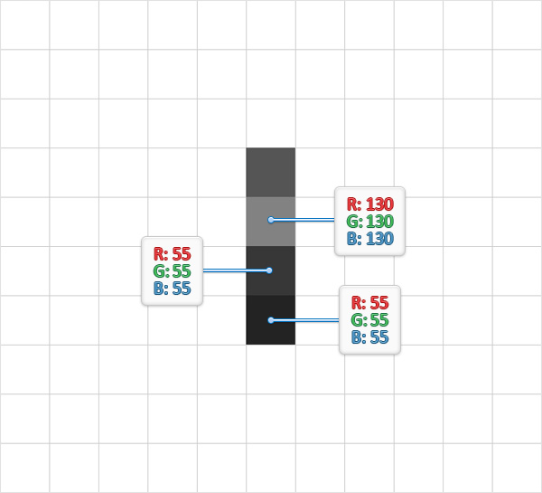
Pick the Rectangle Tool (M) and focus on your Toolbar. Remove the color from the stroke then select the fill and set its color at R=85 G=85 B=85. Move to your artboard and simply create a 1px square, the Snap to Grid should ease your work.

Step 2
Make sure that the Rectangle Tool (M) is still active and create another three, 1pxsquares. Use the fill colors pointed in the following image then place these new shapes one under the other as shown below.
Step 3
Reselect the four squares made so far and simply hit Control-G to Group them. Make sure that this fresh group is selected and make a copy in front (Control-C > Control-F). Select your group copy and simply drag it 2px to the right as shown in the second image.

Step 4
Using the Rectangle Tool (M), create four, 2 x 1px rectangles, use the fill colors shown below then place these new shapes as shown in the following image.

Step 5
Using the Rectangle Tool (M), create four, 7 x 1px rectangles, use the fill colors shown below then place these new shapes as shown in the following image.

Step 6
Using the Rectangle Tool (M), create a 6 x 1px shape, set the fill color at R=204 G=149 B=4 and place it as shown in the first image. Focus on the right side of the new rectangle and switch to the Direct Selection Tool (A). Select both anchor points and simply drag them 1px up. Reselect the shape made in this step and go toEffect > Warp > Arc. Enter the properties shown in the following image and clickOK.

Step 7
Using the Rectangle Tool (M), create a 9 x 1px shape, set the fill color at R=234 G=179 B=34 and place it as shown in the first image. Focus on the right side of the new rectangle and switch to the Direct Selection Tool (A). Select both anchor points and simply drag them 1px down. Reselect the shape made in this step and go to Effect > Warp > Arc. Enter the properties shown in the following image and clickOK.

Step 8
Using the Rectangle Tool (M), create a 7 x 1px shape, set the fill color at R=204 G=149 B=4 and place it as shown in the first image. Focus on the right side of the new rectangle and switch to the Direct Selection Tool (A). Select both anchor points and simply drag them 1px down. Reselect the shape made in this step and go to Effect > Warp > Arc. Enter the properties shown in the following image and clickOK. Select all three, yellow shapes and simply hit Shift-Control-[ to send them to back.

Step 9
Select the shapes highlighted in the following image and simply drag them inside theSwatches panel (Window > Swatches) to save your own pattern. Once you can see it in the Swatches panel you can simply remove all the shapes used to create it. Return to the Swatches panel, double-click on your pattern and name it "endTile".

Step 10
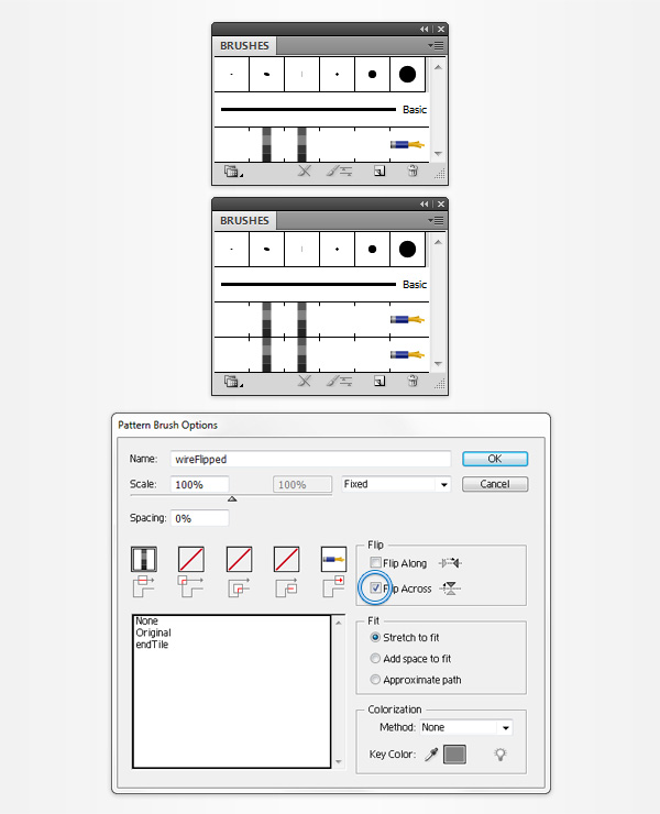
Focus on your artboard and select the remaining group of shapes then open theBrushes panel (Window > Brushes) and click the New Brush button (pointed by the little, blue arrow in the following image). Check the Pattern Brush box then clickOK to open the Pattern Brush Options window. Enter "wire" in the Name box then move down to the Tile boxes. Select the End Tile box and simply add the "endTile" pattern from that list. Finally, click OK and you should find your new pattern brush inside the Brushes panel. If you got it simply remove that group of squares from your artboard.

Step 11
Focus on the Brushes panel, select your "wire" pattern brush and simply drag it above the New Brush button to duplicate it (or open the fly-out menu of theBrushes panel and go to Duplicate Brush). Double-click on your brush copy, rename it "wireFlipped", check the Flip Across box then click OK.
3. Create Four Art Brushes and Add a Simple Background
Step 1
For the following steps you will need a grid every 0.25px, so go to Edit > Preferences > Guides & Grid and enter 0.25 in the Gridline every box. Using theEllipse Tool (L), create a 0.25 x 10px shape and set the fill color at white.
Disable the Snap to Grid (View > Snap to Grid), switch to the Convert Anchor Point Tool (Shift-C) and simply click on the bottom anchor point. Enable the Snap to Grid (View > Snap to Grid), grab the Direct Selection Tool (A), select the two anchor points highlighted in the second image and simply drag them 2px up as shown in the following image.

Step 2
Make sure that your thin, white shape is still selected, focus on the Brushes panel and click the New Brush button. Check the Art Brush box and click OK. Enter "0.25 white" in the Name box then click OK. Once you can see the new art brush inside your Brushes panel you can remove that thin, white shape from your artboard.

Step 3
Using the Ellipse Tool (L), create a 0.25 x 10px shape and set the fill color atR=240 G=200 B=227. Disable the Snap to Grid (View > Snap to Grid), switch to the Convert Anchor Point Tool (Shift-C) and simply click on the bottom anchor point. Enable the Snap to Grid (View > Snap to Grid), grab the Direct Selection Tool (A), select the two anchor points highlighted in the second image and simply drag them 2px up as shown in the following image.
Make sure that this thin, pink shape stays selected, focus on the Brushes panel and click the New Brush button. Check the Art Brush box and click OK. Enter "0.25 pink" in the Name box then click OK. Once you can see the new art brush inside your Brushes panel you can remove that thin, pink shape from your artboard.

Step 4
Using the Ellipse Tool (L), create a 0.5 x 10px shape and set the fill color at white. Disable the Snap to Grid (View > Snap to Grid), switch to the Convert Anchor Point Tool (Shift-C) and simply click on the bottom anchor point. Enable the Snap to Grid (View > Snap to Grid), grab the Direct Selection Tool (A), select the two anchor points highlighted in the second image and simply drag them 2px up as shown in the following image.
Make sure that this thin, white shape stays selected, focus on the Brushes panel and click the New Brush button. Check the Art Brush box and click OK. Enter "0.5 white" in the Name box then click OK. Once you can see the new art brush inside your Brushes panel you can remove that white shape from your artboard.

Step 5
Using the Ellipse Tool (L), create a 0.5 x 10px shape and set the fill color at R=255 G=136 B=248. Disable the Snap to Grid (View > Snap to Grid), switch to theConvert Anchor Point Tool (Shift-C) and simply click on the bottom anchor point. Enable the Snap to Grid (View > Snap to Grid), grab the Direct Selection Tool (A), select the two anchor points highlighted in the second image and simply drag them 2px up as shown in the following image.
Make sure that this thin, pink shape stays selected, focus on the Brushes panel and click the New Brush button. Check the Art Brush box and click OK. Enter "0.5 pink" in the Name box then click OK. Once you can see the new art brush inside yourBrushes panel you can remove that pink shape from your artboard.

Step 6
Disable the Grid (View > Hide Grid) and the Snap to Grid (View > Snap to Grid). Pick the Rectangle Tool (M) and simply click on your artboard to open theRectangle window. Enter 610 in Width box and 410 in the Height box then click OKto get your 610 x 410px rectangle.
Make sure that this new shape stays selected and set its fill color at R=17 G=66 B=103. Open the Appearance panel (Window > Appearance) and add a second fill for your rectangle using the Add New Fill button (pointed by the little, blue arrow in the following image). Select this new fill, set the color at black, lower its Opacity to10%, change the Blending Mode to Multiply and go to Effect > Artistic > Film Grain. Enter the properties shown in the following image and click OK.
Next, you need to center this rectangle, so open the Align panel (Window > Align). Set the aligning to Artboard (open the fly out menu and go to Show Options if you can't see the Align To section as shown in the following image) then simply click theHorizontal Align Center and Vertical Align Center buttons. In the end your rectangle should cover the entire artboard.
Move to the Layers panel (Window > Layers), open the existing layer, simplydouble-click on the shape made in this step and name it "bg". You should also lock it to make sure that you won't accidentally select/move it.

4. Create the Main Text Shapes
Step 1
Pick the Type Tool (T), simply click on your artboard and add the "DANGER" white piece of text. Open the Character panel (Window > Type > Character), use the "GoodDog font", set the size at 150pt and the tracing at 100.
Make sure that your piece of text is still selected and hit Shift-Control-O (or go toType > Create Outlines). Select the resulting group of shapes, hit Shift-Control-Gto Ungroup it then hit Control-8 (or go to Object > Compound Path > Make) to turn those six letter shapes into a simple Compound Path.
Move to the Layers panel, double-click on the white compound path made in this step and name it "DANGER".

Step 2
Make sure that your "DANGER" compound path stays selected and focus on theAppearance panel. First, hit Shift-X to transfer the color properties from the fill to the stroke. Select stroke, set the weight at 0.25pt, lower its Opacity to 50% and go to Effect > Distort & Transform > Zig Zag. Enter the properties shown in the following image, click OK and go to Effect > Distort & Transform > Roughen. Enter the properties shown in the following image, click OK and go to Effect > Stylize> Rounded Corners. Enter a 1px Radius and click OK.

Step 3
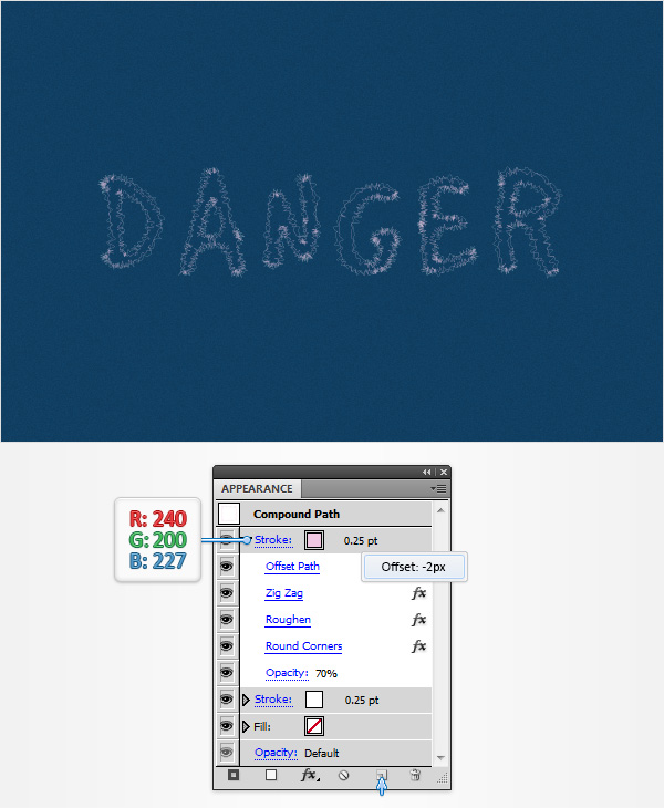
Make sure that your "DANGER" compound path is still selected and focus on theAppearance panel. Select the existing stroke and simply duplicate it using theDuplicate Selected Item button (pointed by the little, blue arrow in the following image). Select the new stroke, replace the white with R=240 G=200 B=227, increase its Opacity to 70% and go to Effect > Path > Offset Path. Enter a -2px Offset and click OK.
Return to the Appearance panel, focus on the pink stroke and simply drag theOffset Path effect above the other three effects.
Step 4
Make sure that your "DANGER" compound path is still selected and focus on theAppearance panel. Select the pink stroke and simply duplicate it using that sameDuplicate Selected Item button. Select the new stroke, set the weight at 0.5pt, replace the existing color with R=255 G=136 B=248, increase the Opacity to 80%, get rid of that Offset Path effect and go to Effect > Blur > Gaussian Blur. Enter an8px Radius and click OK.

Step 5
Make sure that your "DANGER" compound path is still selected and focus on theAppearance panel. Select the top, pink stroke and simply duplicate it using that same Duplicate Selected Item button. Select the new stroke, replace the existing color with white, increase the Opacity to 90%, get rid of that Gaussian Blur effect and go to Effect > Stylize > Outer Glow. Enter the properties shown in the following image and click OK.

Step 6
Reselect your "DANGER" compound path, focus on the Appearance panel and add a fifth stroke using the Add New Stroke button (pointed by the little, blue arrow in the following image). Select this new stroke, drag it in the bottom of the Appearancepanel, set the weight at 1pt and the color at R=109 G=15 B=61 then lower itsOpacity to 70%. Make sure that your "DANGER" compound path is still selected, open the Graphic Styles panel (Window > Graphic Styles) and simply click theNew Graphic Style button (pointed by the little, blue arrow in the following image) to save your own graphic style.
Keep focusing on the Graphic Styles panel, simply double-click on your new graphic style and name it "electricity".

Step 7
Reselect your "DANGER" compound path and go to Object > Path > Offset Path. Enter a 10px offset and click OK.
Make sure that the resulting compound path stays selected, focus on theAppearance panel and add a new stroke using that same Add New Stroke button. Select this new stroke, drag it in the bottom of the Appearance panel, set the weight at 6pt and the color at R=109 G=15 B=61 then go to Effect > Blur > Gaussian Blur. Enter a 20px Radius and click OK. Move to the Layers panel, double-clickon the compound path made in this step and rename it "DANGER Outline".

5. Add the Wires
Step 1
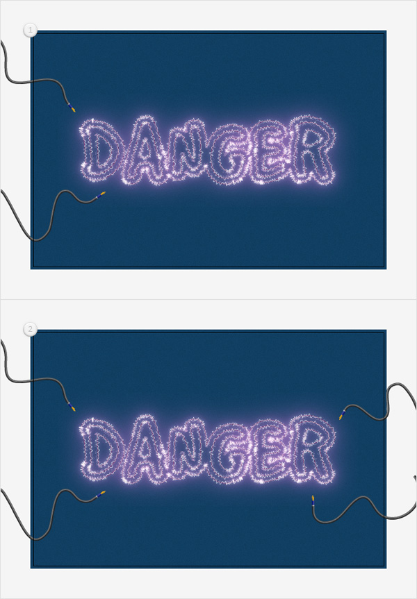
Pick the Paintbrush Tool (B), select your "wire" pattern brush from the Brushespanel and draw two paths roughly as shown in the first image. Make sure that you start drawing the path from the left. Use the same tool, select your "wireFlipped" pattern brush from the Brushes panel and draw another two paths roughly as shown in the second image. This time make sure that you're starting from the right.
Step 2
Select the four paths with the wire pattern brushes and go to Effect > Stylize > Drop Shadow. Enter the properties shown in the top, left window, click OK and go again to Effect > Stylize > Drop Shadow. Enter the properties shown in the top, middle window, click OK and go once again to Effect > Stylize > Drop Shadow. Enter the properties shown in the top, right window, click OK and go one more time to Effect > Stylize > Drop Shadow. Enter the properties shown in the bottom, left window, click OK and go one last time to Effect > Stylize > Drop Shadow. Enter the properties shown in the bottom, right window and click OK. Make sure that the four paths with the wire pattern brushes are still selected and Group them (Control-G).

6. Create the Electricity Sparks that Connect Your Wires and the Text
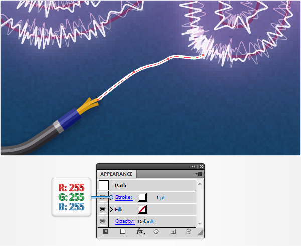
Step 1
Using the Paintbrush Tool (B) or the Pen Tool (P), create a simple path that connect the wire with the text as shown in the following image. For starters add a simple, 1pt, white stroke for this new path.
Step 2
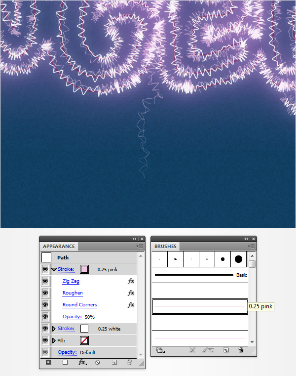
Reselect the path that connects your wire with the text, focus on the Graphic Stylespanel and simply click on the "electricity" graphic style.
Make sure that your path stays selected and focus on the Appearance panel. Select the 0.25pt, white stroke and lower its Opacity to 30%, select the 0.25pt, pink stroke and lower its Opacity to 50% then select the 0.5pt, pink stroke and lower itsOpacity to 70%. Having this little path still selected, return to the Graphic Stylespanel and save a new graphic style. Name it "spark".

Step 3
Using the Paintbrush Tool (B) or the Pen Tool (P) create a bunch of paths that connect the wires with the text as shown in the following image. Make sure that all these new paths are selected and simply add the "spark" graphic style. Each of these paths can easily change their look depending on the number of anchor points. It's all because of the Zig Zag effect. Feel free free to use the Add Anchor Point (+)or the Remove Anchor Point Tool (-) to easily add/remove anchor points for/from a certain path if you feel that it look too bleak/crowded.

7. Create the Fading Electricity Sparks
Step 1
Using the Paintbrush Tool (B) or the Pen Tool (P), create a simple path that start from within the text as shown in the following image. Make sure that you start the drawing from the inside of the text. For starters add a simple, 1pt, white stroke for this new path.

Step 2
Make sure that your little path stays selected and focus on the Appearance panel. Select the stroke, add the "0.25 white" art brush from your Brushes panel, lower itsOpacity to 30% and go to Effect > Distort & Transform > Zig Zag. Enter the properties shown in the following image, click OK and go to Effect > Distort & Transform > Roughen. Enter the properties shown in the following image, click OKand go to Effect > Stylize > Rounded Corners. Enter a 1px Radius and click OK.

Step 3
Make sure that your little path is still selected and focus on the Appearance panel. Select the existing stroke and simply duplicate it using that same Duplicate Selected Item button. Select the new stroke, replace the "0.25 white" art brush with the "0.25 pink" art brush and increase its Opacity to 50%.
Step 4
Make sure that your little path is still selected and focus on the Appearance panel. Select the top stroke and simply duplicate it using that same Duplicate Selected Item button. Select the new stroke, replace the "0.25 pink" art brush with the "0.5 pink" art brush, increase its Opacity to 70% and go to Effect > Blur > Gaussian Blur. Enter an 8px Radius and click OK.

Step 5
Reselect your little path and focus on the Appearance panel. Select the top stroke and simply duplicate it using that same Duplicate Selected Item button. Select the new stroke, remove the existing Gaussian Blur effect and replace the "0.5 pink" art brush with the "0.5 white" art brush then increase its Opacity to 90% and go toEffect > Stylize > Outer Glow. Enter the properties shown in the following image and click OK. Make sure that your little path is still selected, focus on the Graphic Styles panel, save a new graphic style and name it "fadingSpark".

Step 6
Using the Paintbrush Tool (B) or the Pen Tool (P) create some new paths as shown in the following image. Make sure that all these new paths are selected and simply add the "fadingSpark" graphic style. Don't forget that you can easily add/remove anchor points and change the look of your paths.

Step 7
Using the Pen Tool (P) create a tiny path as shown in the following image. Select it, focus on the Graphic Styles panel and simply add the "fadingSpark" graphic style. Make sure that your path stays selected and focus on the Appearance panel. Select the top stroke and simply replace the "0.5 white" art brush with the "0.25 white". Having this little path still selected, return to the Graphic Styles panel and save a new graphic style. Name it "fadingSparkThin".

Step 8
Using the Pen Tool (P), create some new paths as shown in the following image. Make sure that all these paths are selected and simply add the "fadingSparkThin" graphic style.

8. Create the Glowing Spots
Step 1
Enable the Snap to Grid (View > Snap to Grid). For this step you will need a grid every 1px, so go to Edit > Preferences > Guides & Grid and enter 1 in theGridline every box. Using the Ellipse Tool (L), create a 15 x 3px shape and set the fill color at R=220 G=118 B=215.

Step 2
Make sure that your squeezed, pink shape stays selected and focus on theAppearance panel. Select the existing fill and go to Effect > Blur > Gaussian Blur. Enter a 2px Radius and click OK.
Return to the Appearance panel and add a second fill for your shape using that same Add New Fill button. Select the new fill, set the color at white, lower itsOpacity to 80%, change the Blending Mode to Overlay and go to Effect > Path > Offset Path. Enter a -2px Offset, click OK and go to Effect > Distort & Transform > Pucker & Bloat. Drag the slider at -70%, click OK and go to Effect > Stylize > Feather. Enter a 2px feather radius and click OK.

Step 3
Make sure that your squeezed shape is still selected, focus on the Appearancepanel and add a third fill. Select it, set the color at white, change the Blending Modeto Overlay and go to Effect > Path > Offset Path. Enter a -1px Offset, click OKand go to Effect > Distort & Transform > Pucker & Bloat. Drag the slider at -70%, click OK and go to Effect > Stylize > Feather. Enter a 1.5px feather radius and clickOK. Move to the Layers panel, double-click on the shape edited in this step and simply name it "glow".

Step 4
Multiply (Control-C > Control-F) your "glow" shape and spread the copies along your text as shown in the following image.

9. Increase the Darkness for the Overall Illustration
Step 1
Disable the Grid (View > Hide Grid) and the Snap to Grid (View > Snap to Grid). Using the Rectangle Tool (M), create a new 610 x 410px rectangle and center it using the Horizontal Align Center and Vertical Align Center buttons from theAlign panel.
Make sure that this new shape stays selected and focus on the Appearance panel. Select the existing fill, open the Gradient panel (Window > Gradient) and simply click on the gradient thumbnail to add the default black to white linear gradient.
Keep focusing on your Gradient panel, select Radial from the Type drop-down menu then move to the gradient colors. Select the right slider, set the color at black (R=0 G=0 B=0) then move the left slider. Select it, set the color at R=17 G=66 B=103 then focus on the Opacity box (from the Gradient panel) and set it at 0%.
Return to the Appearance panel, reselect that fill, lower its Opacity to 90% and change the Blending Mode to Soft Light. Finally, make sure that the fill stays selected, grad the Gradient Tool (G), focus on your artboard and stretch that gradient as shown in the following image.

Step 2
Make sure that your front rectangle is still selected, focus on the Appearance panel, select the existing fill and duplicate it using that same Duplicate Selected Itembutton. Select the new fill, lower its Opacity to 30%, change the Blending Mode toColor Burn and move to the Gradient panel. Select the left gradient slider, replace the existing color with R=234 G=179 B=34, increase its Opacity to 100% then focus on the Location box (from the Gradient panel) and drag that slider at 25%.

Step 3
Make sure that your front rectangle is still selected, focus on the Appearance panel, select the top fill and duplicate it using that same Duplicate Selected Item button. Select the new fill, increase its Opacity to 75%, change the Blending Mode to Soft Light and replace the existing radial gradient with the one shown in the following image. Remember that the yellow zero from the Gradient image stands for Opacitypercentage.

Step 4
Make sure that your front rectangle is still selected, focus on the Appearance panel and add a fourth fill using that same Add New Fill button. Select the new fill, set the color at black, lower its Opacity to 10%, change the Blending Mode to Multiplyand go to Effect > Artistic > Film Grain. Enter the properties shown in the following image and click OK.
Step 5
Make sure that your front rectangle is still selected, focus on the Appearance panel, select the second fill (start the count from the bottom) and duplicate it using that same Duplicate Selected Item button. Select the fill, drag it in the top of theAppearance panel and replace the existing radial gradient with the one shown in the following image. Don't forget that the yellow zeros from the Gradient image stand forOpacity percentage while the white number stands for Location percentage.

Danger! Danger! High Voltage!
Here is how it should look. I hope you've enjoyed this tutorial and can apply these techniques in your future projects.

0 komentar :